Seat Picker
UX/UI
Goal
Design a world-class seat picking experience for box office users.
My Role
Lead Product Designer
Picking Seats
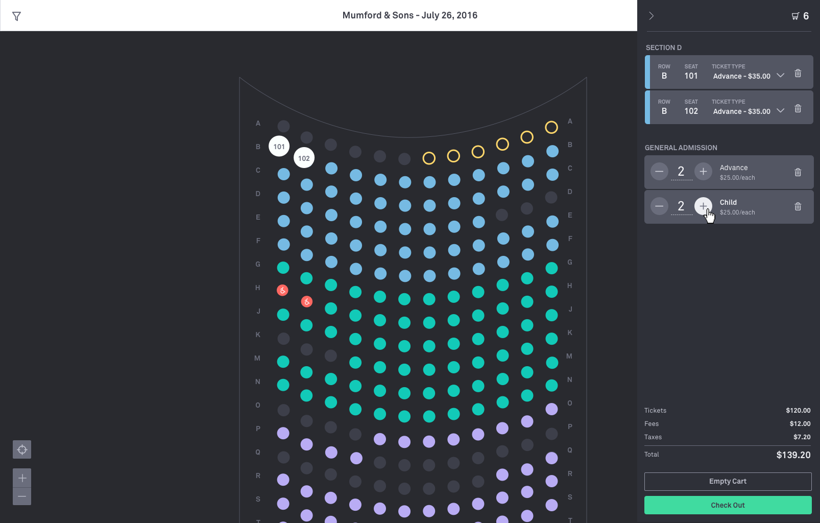
Ticketfly aimed to get fans into venues and seated faster by leveraging scalable technology designed for events of all shapes and sizes, high-demand on-sales, and maximum efficiency. The challenge involved working in iterations to develop a world-class reserved seating platform in two phases.
First Iterations
The product's first iteration introduced key features, including zooming, panning, and seat selection. This initial prototype was developed to validate the design concepts and ensure their effectiveness.
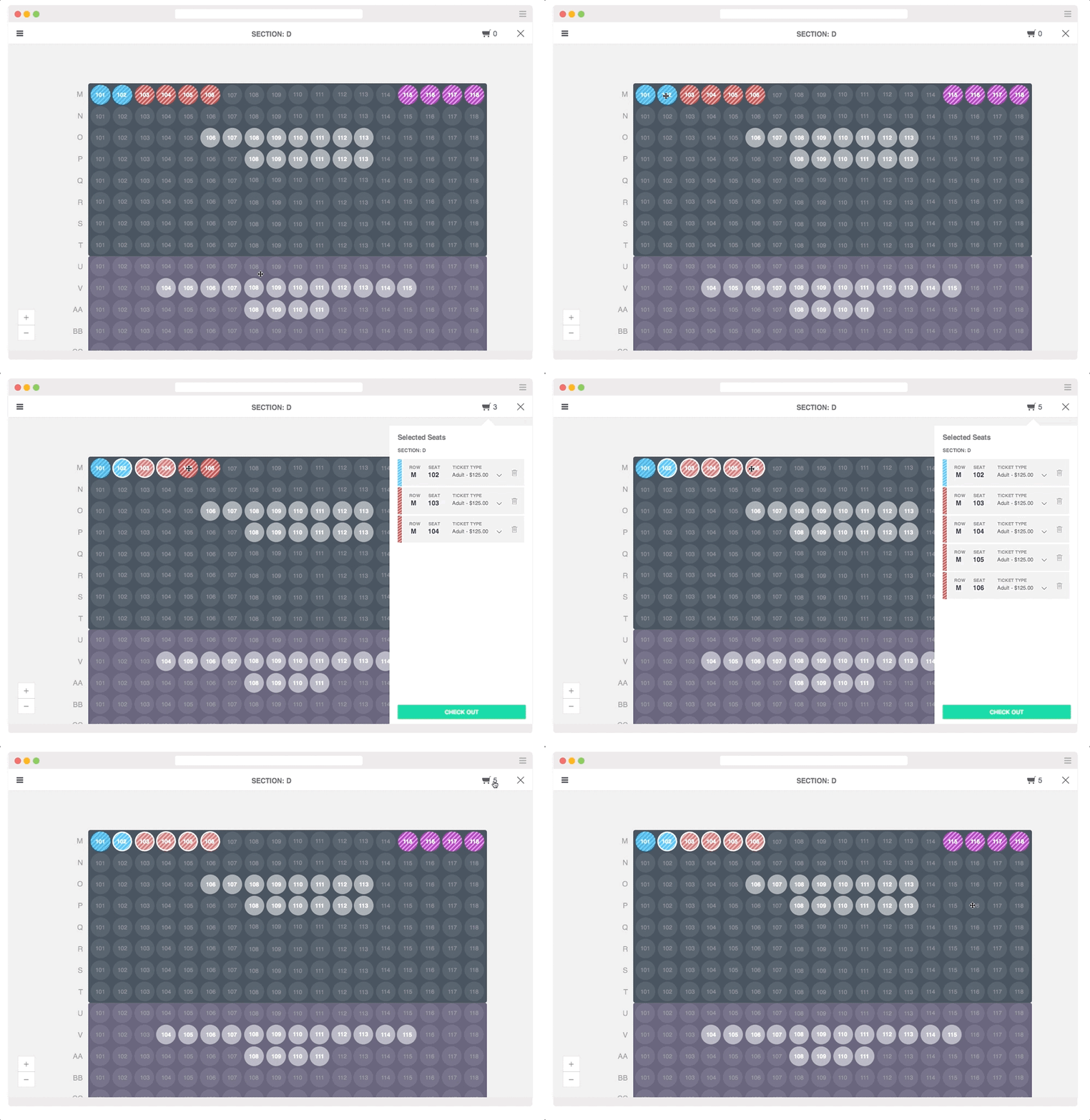
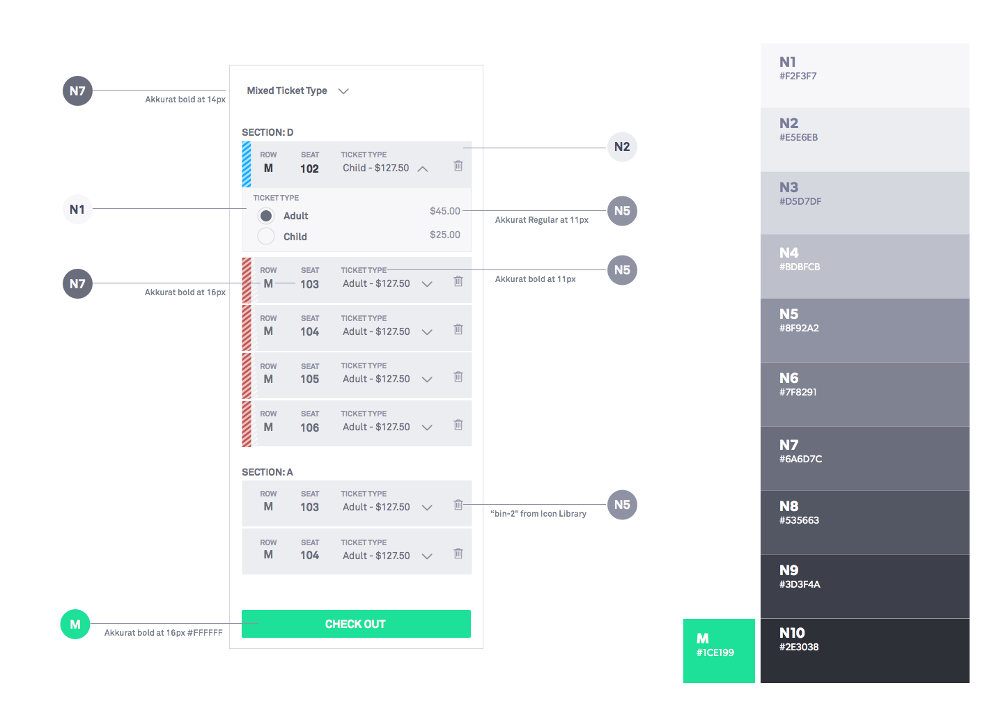
We discovered that box office users primarily operated in dimly lit environments. The light color scheme not only made it difficult to locate seats but also caused glare on the box office glass. Additionally, some box office users preferred displaying the seat map to fans so that they could choose their seats looking at the map.
We explored dark, muted backgrounds that could allow the price-level colors on each seat to pop. As a result, the interface fades away, and what's mainly visible are the available seats and price colors, which is a primary goal.
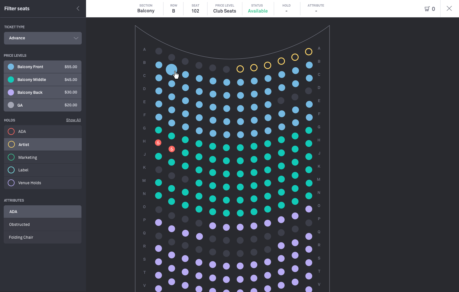
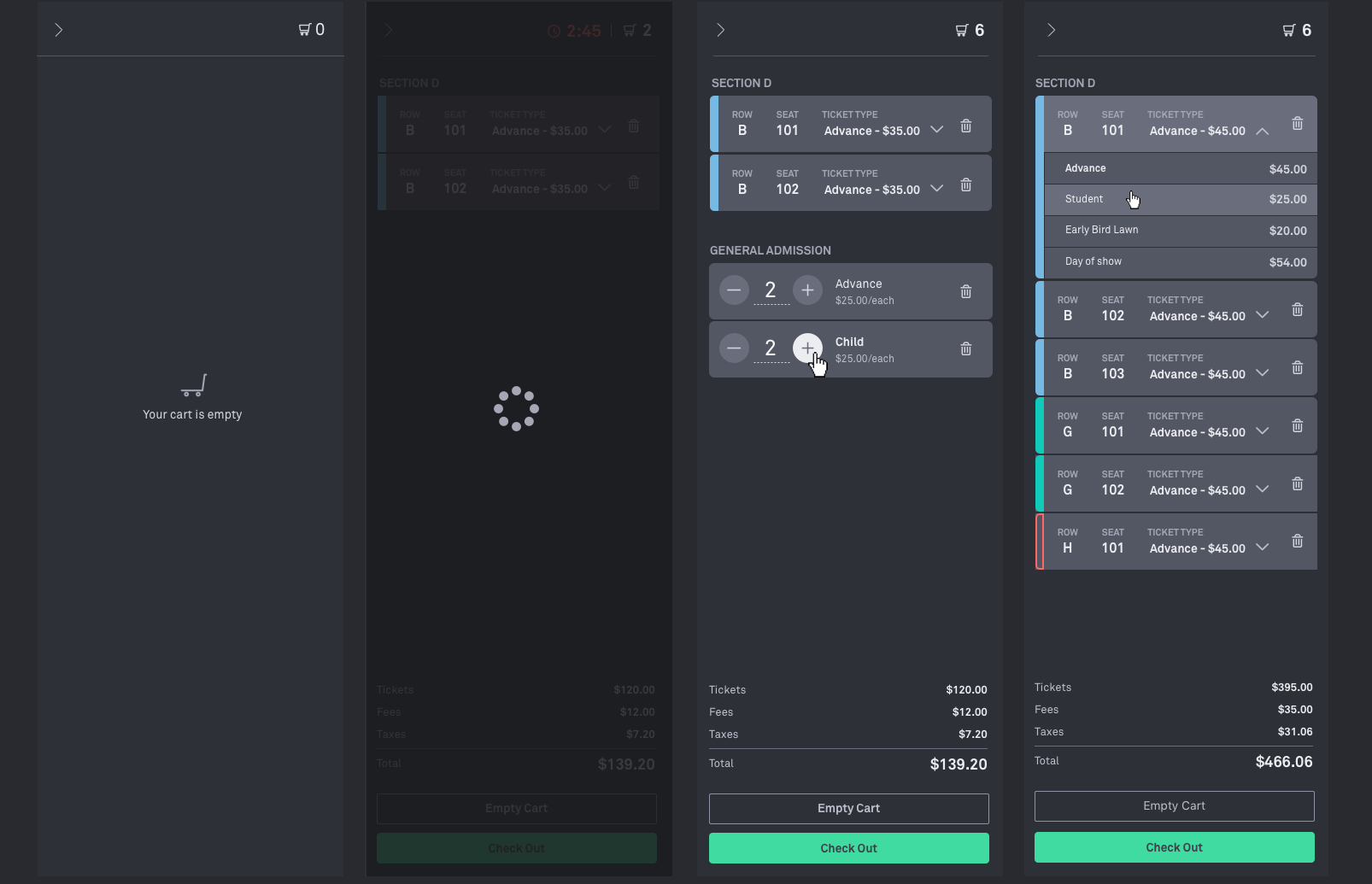
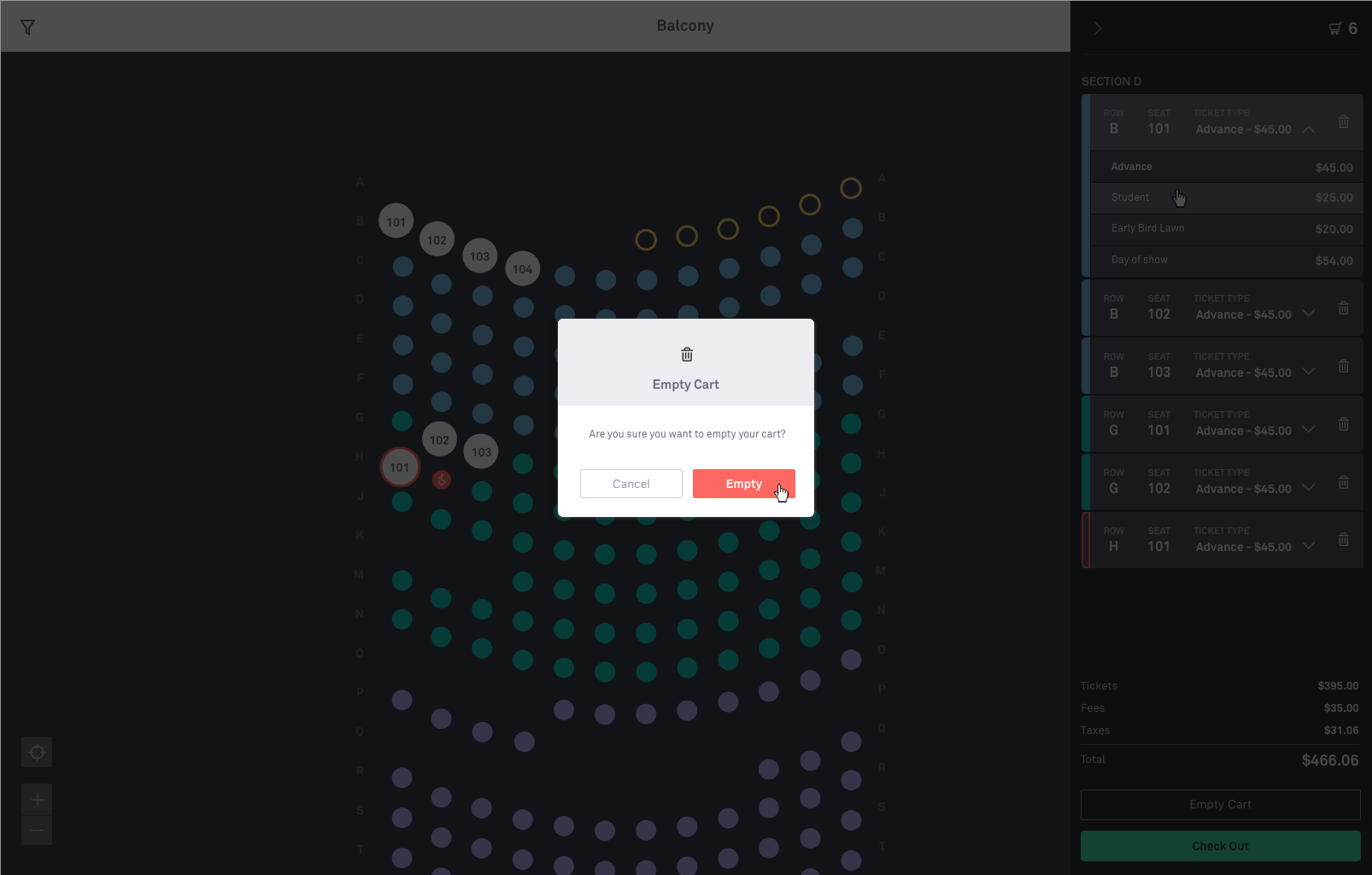
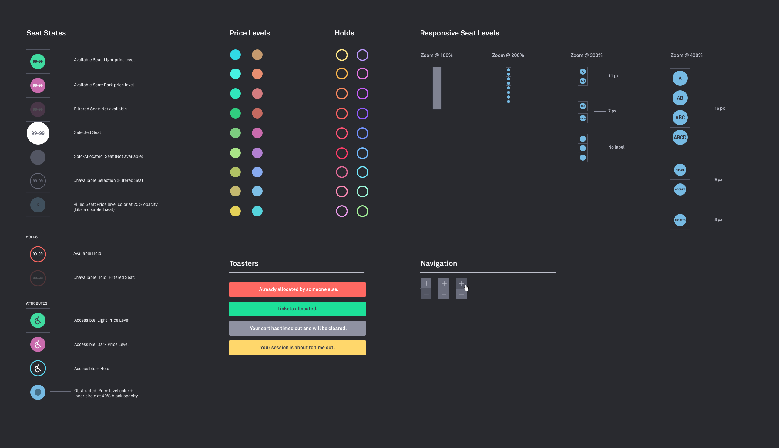
Layering data at multiple zoom levels allowed us to optimize rendering times and predict what the user wants. We designed a responsible seat-level system to cover most edge cases.
This design allowed us to remove unnecessary data at the section level, keep the price-level colors, and display seat labels and row names at deeper zoom levels.
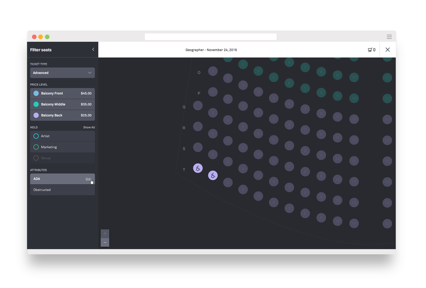
Ticketfly's seat picker is only accessible via our Box Office product.
SELECTED CASE STUDIES
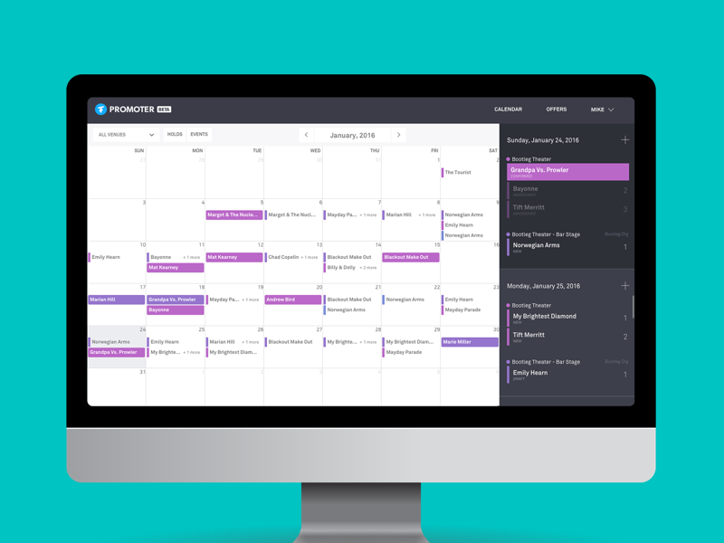
PromoterProject type
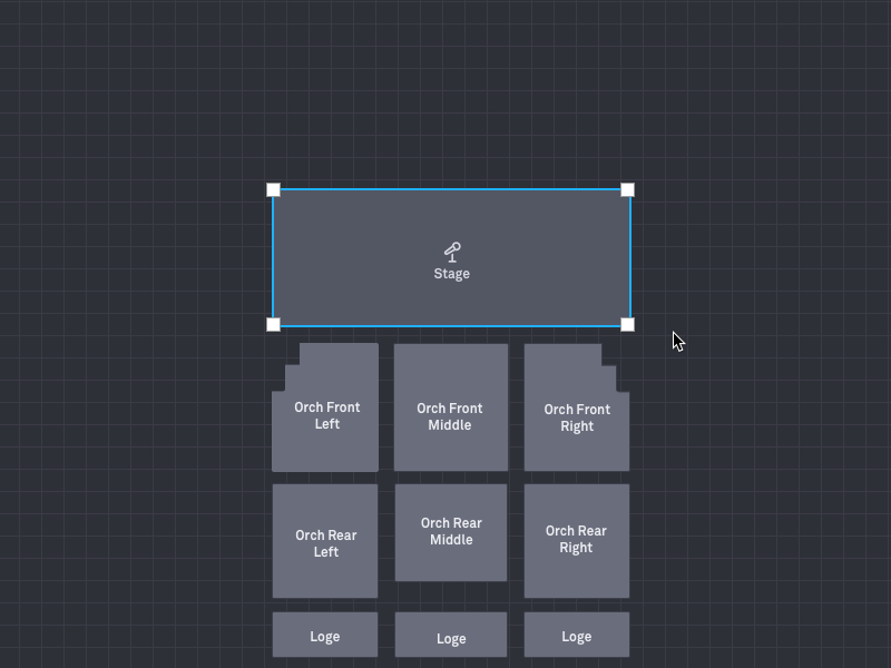
Venue BuilderProject type
